The Art of Rebranding – MTS Style
Posted on August 14, 2015
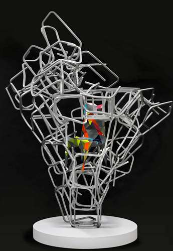
A 12 ft. tall sculpture was a talked-about centerpiece at the HD Expo.
The defining characteristic of a hotel, restaurant, club or other facility is its overall “look” – the appeal it holds for those who are visiting. Considerable thought is given to choosing the perfect color palette, furnishings and other touches that set this property apart from others in.
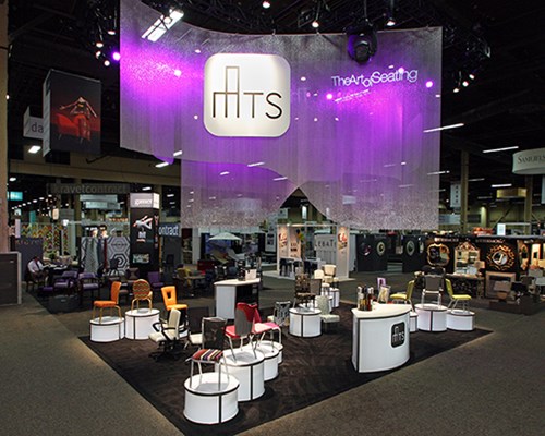
The new MTS HD Expo exhibit carried the theme and new logo to great heights.
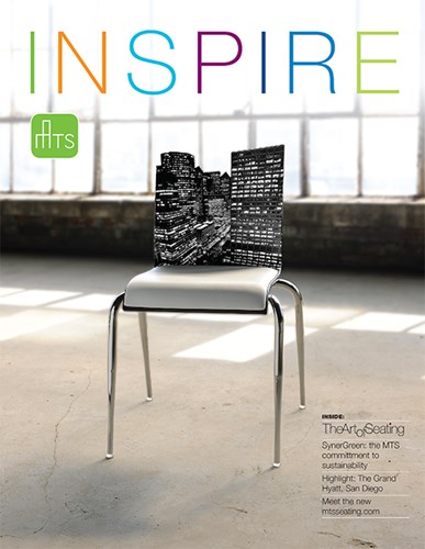
MTS’s new Inspire brochure was introduced in conjunction with the branding. It’s designed in a magazine format and will be produced twice a year.
Michigan-based MTS Seating believes that hospitality seating can and should be a significant component of a facility’s look. They view seating as an art, reflecting a business’ overall style and design as well as providing function and comfort. It’s what Communica called “The Art of Seating,” and developed a program that brought the approach to life across multiple channels.
Beginning with a branding workshop that explored the brand’s DNA and positioning, Communica applied those findings to all of the company’s messaging and visual elements. It was first incorporated into the company’s identity and a new logo that brought their focus on design to the forefront.
“The new logo carries a very simple design that communicates both the company’s name and what they do in a clean, architectural way,” explains Jeff Kimble of Communica.
“Then we created www.theartofseating.com website to introduce this new direction and highlight how The Art of Seating can be interpreted in many ways,” Kimble said. A highlight of the website is a series of chairs that were re-imagined by MTS employees and friends, including students from a local high school art class. Several of these chairs were used in a teaser print ad campaign that featured the chair and The Art of Seating. This site is also incorporated into MTS’s newly developed corporate website: www.mtsseating.com.
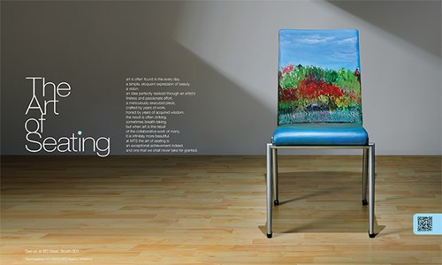
One of several print ads introducing The Art of Seating and the re-imagined chairs.
Kimble explained, “We were leading up to the introduction of the new branding at the HD Expo trade show. The new logo and branding were all on display at the show, for the first time in one place.” In addition, visitors to the show were greeting by a 12 foot tall piece of modern art – constructed entirely of chair frames – that was created by MTS’s Josh Swy, director of design.
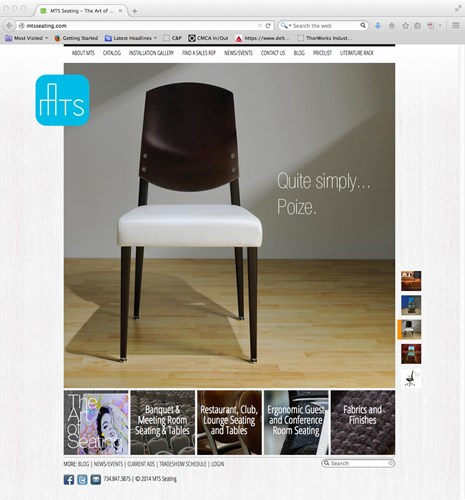
The new MTS website (www.mtsseeating.com).
The program was supported by a comprehensive media relations and real-time media program around the hashtag #theartofseating. In addition, show visitors were encouraged to take a “Selfie with the Sculpture” to be entered into a drawing for several prizes.
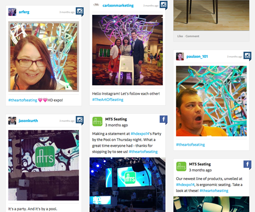
Selfies at the Sculpture were tagged #theartofseating during the HD Expo.
This program has “really galvanized MTS’s dedication to design, customer collaboration and customer service,” said Kimble. “This program truly illustrates the company’s culture. As we go forward we are developing a series of case studies and other materials that highlight the engineering and customer satisfaction expertise at MTS – all properties that carry out the theme ‘The Art of Seating’ to all the company’s customers.”
